It’s Time for a Personal Security Cleanup

Have you rotated your passwords in the last 3 years? How long have you been using the same ol' SSH Key? It's time to do a Personal Security Clean Up!
GPIO External Wakeup on ESP32 with MongooseOS and ESP-IDF

One of the reasons I love MongooseOS is that it makes getting started easy and then provides a variety of conveniences for development, but all the while more powerful capabilities are openly available to you when and if you want them. In particular, the full power of the Espressif IoT Development Framework (ESP-IDF), the official SDK for the ESP32, is available without giving up all the creature comforts. MongooseOS provides easy access in ...
Battery Monitoring on the Adafruit Huzzah32 ESP32 with MongooseOS
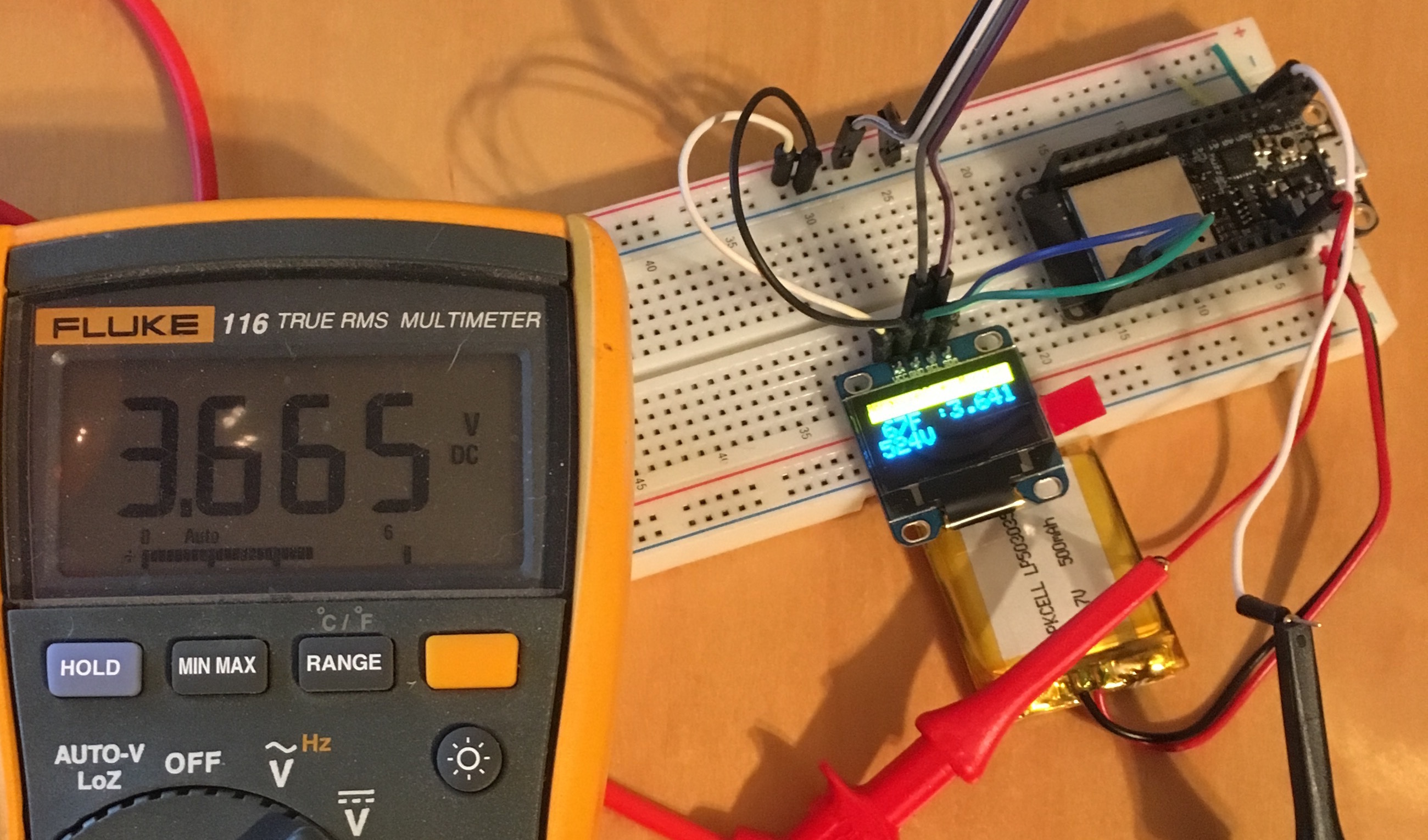
Adafruit is undoubtedly the most important company for Makers and IoT builders. Not only does Adafruit make high quality boards, they also supply the open source drivers we require to make these great components actually work. Given all that Adafruit does for us, its only fair that we pay a little more. While cheapo ESP32 boards can be purchased on Amazon for about $12 and you can find sketchy deals on AliExpress for as little as $6, the ...
Crazy Talk: Firmware & Unikernels Unite
As both Containers and IoT explode, it is an interesting observation to consider the following crazy idea..... will Unikernels begin to bridge the hardware/software divide? In the land of servers, unikernels aren't terribly interesting, especially when containers can simply omit the kernel completely thanks to the legacy of Solaris Zones. To replace the container with a VM seems silly and unnecessary. However, if high density micro-ser...
Opportunities Abound Around the Internet of Things
Becoming recently engrossed in the "Internet of Things", I've been surprised by the challenges associated with building solutions. A common flow can be seen in my work by evaluating a series of questions: What platform will I use?: This consists of a variety of sub-questions: Microcontroller (MCU) or System on a Chip (SOC)?: More specifically, this is a question of whether I need a microprocessor and operating system, namely Linux ...
Team of Teams & Complexity: An Approach for breaking down Silos
Once upon a time we categorized companies into two broad categories with regards to decision making: Centralized & De-centralized. This model is easy to comprehend when we think of a central headquarters housing centralized functions and executives, and then a large number of branches which service local regions. A bank or retail operation is a common example. Thinking on the subject seems non-applicable to companies that lack this distribu...
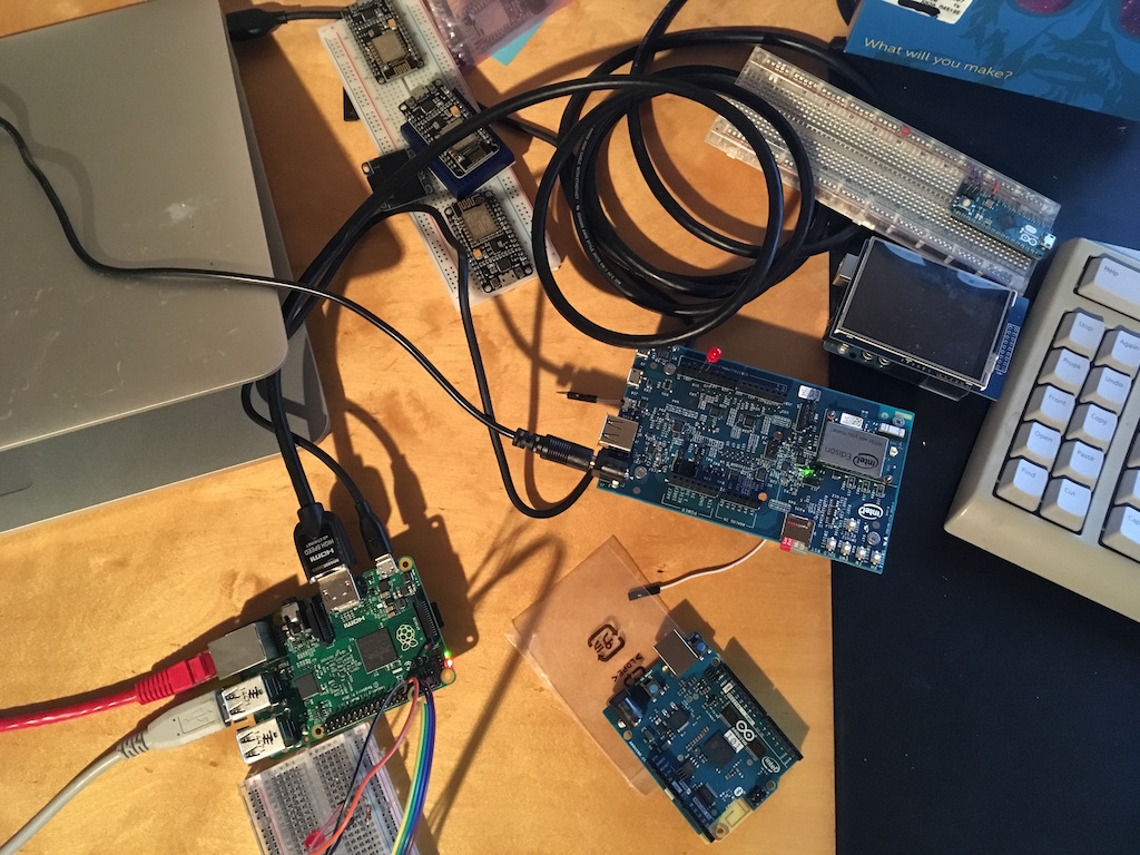
Looking to the Future by Appreciating the Past
I've recently come to the end of an interesting and exciting journey of re-discovery which began on Thanksgiving 2016. While waiting for Thanksgiving dinner to be ready, there was time to kill and we were all just sitting around waiting. My son, Glenn, is 11 and has become a wiz with Lego Mindstorm and I've been introducing electronics and programming to him a little here and there over the years. It had been a while since I did basic ...
Considering Secrets Management

“security” is a series of barriers which require greater time, resources, and will power to overcome than are reasonably available to a potential attacker
Using Hashicorp Vault as a PKI SSL/TLS CA

Encrypting data is important, both in transit and at rest. By far the most popular method of in-transit encryption is SSL/TLS. That sad truth is, except for our public facing web sites, most administrators rarely use it unless they have to. Many companies only run their own CA for VPN's or LDAP infrastructure, and they tend to use old solutions like Easy-RSA. Hashicorp's Vault burst onto the scene last year and has taken secrets management to ...
Containers, Now and Then
I'm excited to announce that Cuddletech is now 100% Docker Powered. This is particularly exciting for me because it comes after being hosted on containers for the previous 10 years of its life. To celebrate it seems like a good time to reflect on how containers have evolved over the last decade. For those not familiar with Cuddletech, since 1999 it has been my personal website dedicated to all things Solaris (and Enlightenment, and my ...